

Looking at Instagram on a Desktop Solved All My Problems
“The medium is the massage”

“I deleted it,” Linda said, looking over my shoulder as I scrolled Instagram on the bus, lingering only for as long as it took to register which friend’s snapshot I was seeing and feel the associated pain of either FOMO or comparison. When I instinctively went to looking at Reels from strangers, I knew I needed to follow Linda’s example.
I deleted Instagram.
For a few days, whenever I pulled out my phone, my thumb uselessly tapped the blank space on my homescreen where the app used to be. I reinstalled and re-deleted it a couple times, telling myself I needed to promote a new article I published or keep up with the zeitgeist, only to lose half an hour to scrolling and realize I’d accomplished neither goal. Then I found a way to get my fix—the browser. When I sat down at my desktop computer to work in the morning, I gave myself ten minutes of Instagram-dot-com on Safari. After a couple days, I stopped using the full ten minutes. After a week, I stopped looking entirely. The experience was so bad, it erased a decade-and-a-half of earned charm and habit.
I almost wrote this essay without the paragraph you’re reading now, where I explain why I wanted to quit Instagram. It seems self-evident. I gave the app too much time and attention and it didn’t give me back anything except distraction. I didn’t feel connected to the friends whose posts I saw. The clips from strangers ranged from forgettable to insipid. And the few pieces of actual information I got were pre-digested and ripped off from original reporting that appeared on a different website. But only the time-wasting was clear when I was looking at my phone. It took a big screen to see the whole truth.
Instagram was made for the phone in a way other social media apps weren’t. For years, there was no way to access Instagram without installing the app. There was no website to log into. There was no iPad version, either. The app was phone-first, phone-only. It was the type of choice design obsessives (like me) like to praise—giving up reach for dedication to quality.
In those days, the app was, like a lot of the iOS design, skeuomorphic; the icon was inspired by old Polaroid photos and scrolling was like looking through a stack of instant camera snapshots. The photos were small and usually hard to decipher, owing to the limited resolution of the iPhone camera and the messiness of the filters users applied.1
These limitations made Instagram the coolest of the social media apps. Facebook was filling up with family members, Twitter was never as fun or funny as Twitter users thought it was, but Instagram was where photographers, artists, and designers went to hang out. Through a sale to Facebook (Meta), the addition of video to compete with Vine, and the prioritization of video to compete with TikTok, Instagram abandoned restraint and lost its cool. It dropped the clever design and anything else that was appealing to a higher aesthetic sense and became just another app that was streamlined to gobble up attention.
This result is obvious when you look at Instagram on a bigger screen. There is no charm, just a black hole pulling your attention to it. But shown at a new proportion, the pull is weaker than a dying Roomba’s. Instead of commanding attention, it sputters a weak suggestion.
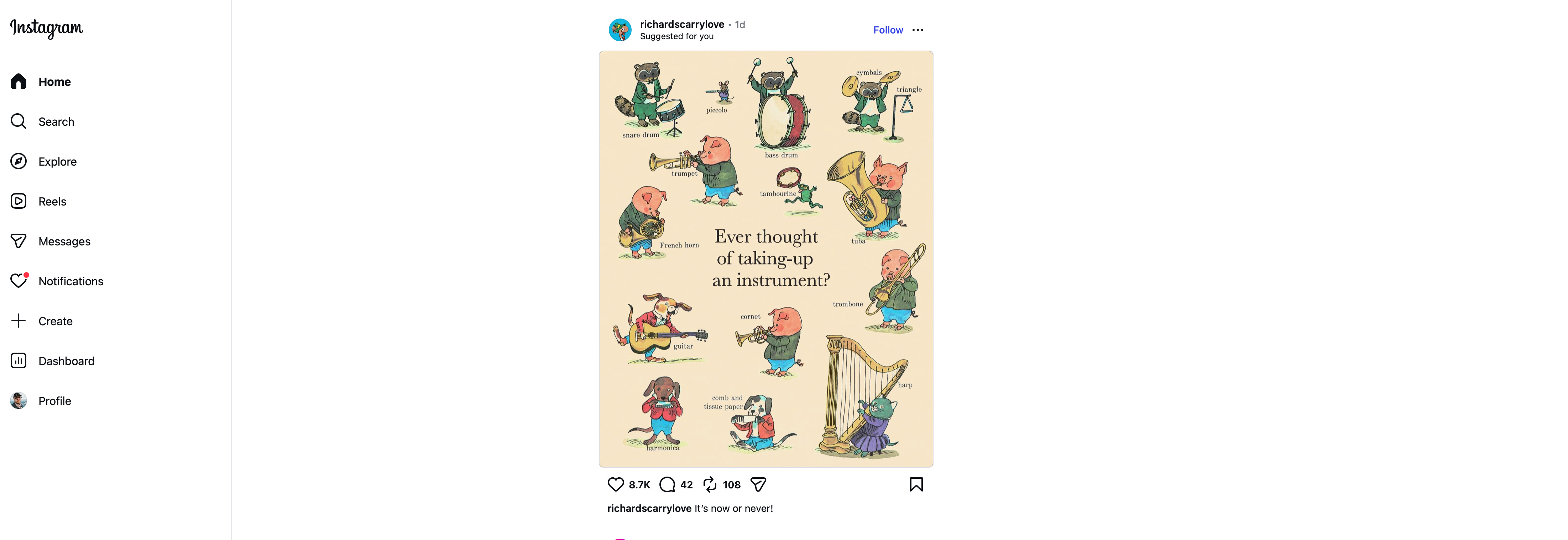
As soon as you open Instagram on a phone, your screen is filled with a moving image, which catches your eye and invites a scroll. If you don’t scroll, you can tap on the stories from friends that float above the first image. Your thumb moves up and down or left and right, feeding Content to your eyes. This opening is the same on a browser, but static space overwhelms the screen—a menu to the left, a half-dozen options for stories, and a lot of white emptiness. Navigating it takes moving your entire hand, placing a cursor, and purposely clicking.
The image is easily ignored for reasons of size and subject. The video seems out-of-proportion to the screen…which it is. Instagram videos, like most videos on mobile devices, are vertically oriented. Instagram used to make every image square. Vertical video was a matter of debate in the early smartphone years, but became standard with TikTok. There are a few ultramodernists and technologists who like to say vertical video should be the standard because it’s how people watch. A few contrarians might be bold enough to assign some aesthetic virtue to video shot in portrait mode. These arguments come across as either fearful resignation or symptoms of Stockholm Syndrome. Vertical video is a format of necessity that rewards users’ inattentiveness and sacrifices a visual grammar that has been honed for over a century. Even when the picture is small, the eye can’t fully grasp motion pictures that are significantly taller than they are wide. Horizontal video conveys information more naturally. Instead of making something worth the mild inconvenience of rotating a phone, posters go for whatever is safest, easiest, and likely to rack up views. It’s a design choice that sacrifices artistry so users don’t have to use their wrists.
Image aside, the Content itself is, for the most part, awful. Reels run through the same few meme formats for jokes and utilize the same buggy background removal software. Even worse are the non-jokey posts, in which someone directly addresses the viewer and speaks literally and without nuance. Most of the time, in my experience, this person is commenting on an article or a trend—they rehash something the New York Times reported and then add their own interpretation at the end, or they explain some psychological concept (usually one they cribbed from Wikipedia) in an attempt to diagnose a cultural ill (usually one they’ve noticed briefly on Instagram and not in real life, such as real life still exists). If these takes were written out to be read or to be the narration for a more put-together video, they would fall apart as weighty pronouncements are stacked on flimsy logic. Otherwise, the videos are news, which is to say it’s someone who did no additional reporting talking about an article that exists on a news website. There are a few good posters out there who prioritize quality, but the platform rewards hacks and underbaked pundits, and so it is full of hacks and underbaked pundits.
The phone softens the grating edges of the worst content. It makes the slapdash nature of the content seem almost necessary. The small videos seem big because they fill the screen. And even if you sit on your couch and scroll, a mobile experience suggests mobility—a portability that excuses looseness. But no part of the technology requires sloppiness. Users can edit videos on advanced software and upload their cuts to the platform (I’ve done this for many of the videos I’ve posted). The technology, does, however, demand constant posting to keep in the algorithm’s good graces. This discourages thought and consideration. Pleasing the algorithm means doing less to please the users.
More than anything else, the larger screen invites the realization that there’s more out there. The browser’s navigation bar lingers above Instagram on the big screen. You can type anything into it—another website, a search keyword, or a question that’s on your mind. Mobile apps don’t encourage this. At first, the smartphone was a portable connection to the infinite web. As apps proliferated, they put up walls. Apps didn’t link to each other or to the wider world. To follow a link on Instagram takes a series of taps that shift the entire screen. On desktop, it’s a couple clicks that only alter part of the overall display. You can easily leave. And the more often you leave, the less appealing it is to come back.
The wider web isn’t the same, though. It’s been diminished through neglect, laziness, and profit extraction. Designers and hosts have tried to make sites one-size-fits-all. Sites ask to send notifications, they push users to an app, and they offer AI summaries. They waste the space of the big screen and the time of the users who visit. Finding a site that’s well-made, respectful to its users, and fun to visit is difficult, but not impossible. Still, maybe the most tempting thing to do, when looking at mobile sites on a big screen, is press the shortcut to quit. Don’t just leave the site, leave the web. Go do something else. That’s what I ended up doing most of the time.
A few weeks into my experiment, I felt the need to post another link to an article I had published. I downloaded Instagram again, posted the update, and set a reminder to delete the app the next day. I didn’t need it. After my time away, the app wasn’t a place I wanted to be. The allure had drained from the little orangeish-pink icon (maybe my poor color perception helped me not want to be on the app). I kept looking beyond the boundaries of my phone, wondering what else there was to see.
There’s a modern misconception that instant photos were always lesser than photos taken on film rolls and developed, but that’s not the case. Polaroid was a revolutionary imaging company, and their cameras produced sharp pictures on both the original peel-apart film and the later, iconic one-step film (the square shots with the white rectangle at the bottom).
Every word of this! I was late to the game on Instagram, but it always struck me as not particularly good at its basic function (sharing images) and as time went on and more functionality was added, it not only became the worst at all of those things, it also got even more useless as a place to see images you wanted to see. I still have it on my phone, but I barely use it and don't miss it.